How we researched this article
BestProps used document-based research from primary firm sources, checked September 14, 2026. The complete source list, scope, limitations, and commercial-state record appear near the end of this article.
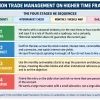
In How New Students Should Start Part 3, ICT spends almost no time talking about entries. The lesson is about chart organization: dividing market information into separate layouts so that a beginner is not reading every concept at once. His worked example is a Nasdaq chart from the opening days of September 2026, and he builds the layouts in TradingView while saying the platform choice is incidental.
This article summarises what he says and attributes his market readings to him. The captions support his words, not the charts behind them: they cannot verify the levels he marks, the settlements he quotes, or any later market outcome. Nothing here is a performance claim or investment advice.
Start by reducing chart clutter
ICT opens on the problem, not the solution. At 0:28 he points to the hype around heat maps, liquidity maps and similar overlays, saying they fill a chart until it is hard to read and hard to tell which information is useful. His remedy is structural: create separate workspaces or layouts and keep each one dedicated to a single category of study, rather than layering everything onto one chart (3:08).

He demonstrates this with the layouts menu in TradingView, where he keeps separate spaces for different series and topics (4:05). The transferable point is the separation itself, not the software: one chart for macro reference levels, another for weekly gaps, another for intraday inefficiencies.
The monthly macro-keys layout
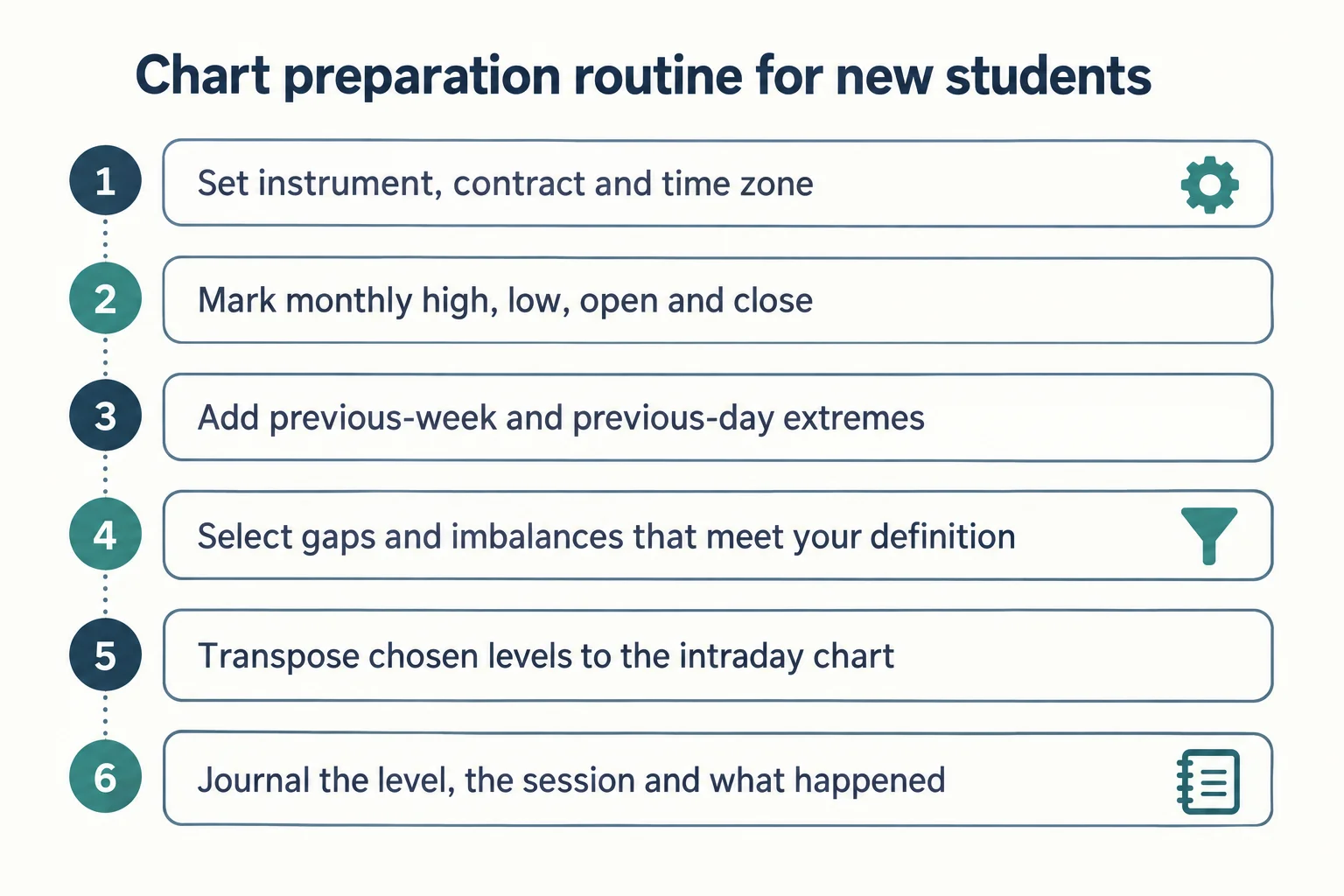
The first layout is deliberately sparse. On the monthly chart he marks the open, high, low and close for each of the previous three months — in his own example the August 2026 monthly high, the August close, the August opening price and the August low, with the same treatment for July and June (5:27, 6:04).
He then stresses what is intentionally missing from this chart: no fair value gaps, no order blocks, no breakers, no first-presented fair value gaps, no new-week or new-day opening gaps. In his words, none of that is on the macro chart, because the purpose is a clean higher-timeframe perspective on where price sits in the last three months, the last month, and the last week (7:09).
He also refers to a full twelve-month view and to quarterly shifts linked to seasonal tendencies (7:41, 8:00). His seasonal remark is explicit about being a tendency rather than a rule: September is usually weak and index futures often make a seasonal low in September or October, rarely as late as November, while he acknowledges the market can do the opposite (12:41).
The layout also carries his premium and discount reading. Above the midpoint of the three-month range is premium; below 50% is discount; near the middle is equilibrium, which he says means dropping to the weekly and daily charts for more context (9:11, 9:36, 14:37). In the recorded session he describes price sitting at the halfway point of the last three months’ range — equilibrium — immediately after the second trading day of September 2026.
One quote captures the philosophy of the exercise: you do not need a heat map or liquidity maps, because open, high, low and close in deference to time will show you where the larger moves are likely to come from (20:45). That is his interpretation of price delivery, and the transcript does not test it.
Adding the previous week’s range
Alongside the monthly data he keeps only the previous week’s high and low, defined as the range between Monday and Friday. He notes that platforms differ on how they handle Sunday data, and that students must sort out that detail for themselves (11:06, 11:14). He also uses consistent colour conventions — blue for weekly and monthly highs, black dashed lines for opening prices — and repeats that only one previous weekly reference should stay on the chart (10:42).
He then reads the week in his own terms: price is in the premium half of the previous week’s range, measured against that range’s equilibrium (12:23). The nesting he describes is three frames — the previous three months, the prior month’s reference levels, and the previous week’s high, low and midpoint — with the instruction to carry relevant higher-timeframe levels down to the intraday chart instead of analysing the intraday chart alone.
Working notes versus permanent levels
A practical workflow detail appears near the middle of the lesson. He says to grade the levels and inefficiencies while studying, drawing the annotations needed to examine a session, and then go back and clean the chart off again so only the assigned reference levels remain (29:57, 31:10).
That creates two categories of chart information: persistent references that define the layout, and temporary analysis used to study one session. For a beginner the separation is useful regardless of whether you accept the interpretive framework, because it keeps screenshots and journal entries comparable over time.
The new-week opening-gap layout
At 32:17 he moves to his new-week opening-gap process. He defines the gap as the difference between the Sunday 6:00 p.m. Eastern opening price and where the market settled the previous Friday, and if a holiday prevents Friday trading he substitutes Thursday (32:36). Later he describes the mechanics as anchoring a measurement to the Friday 4:59 p.m. close and dragging it to the Sunday 6:00 p.m. opening, then naming the object by date — for example, an August 30 new-week gap (35:58, 36:11).
His organizational rules are explicit: keep at least the past five weeks of new-week opening gaps on the chart, label each one with its date, and keep the chart otherwise empty (32:48, 37:22). He uses the platform’s object tree to remove older ones when they pile up, and he says he personally manages most of his data in journals rather than on screen, annotating charts mainly so students can follow his reasoning (37:40). To keep the visible list manageable he copies the layout at the start of a new quarter and deletes the earlier objects rather than carrying them forward indefinitely (38:51, 39:02).
First-presented gaps and the RTH gap matrix
The next layout separates first-presented fair value gaps from the weekly gaps, using Monday’s, Tuesday’s and Wednesday’s first-presented gaps as labelled references, and he says a purist can move them to their own workspace entirely (40:47). He defines the first-presented gap simply as the first inefficiency that forms after 9:30 a.m. Eastern time, and points out that on the session he shows, no fair value gap forms until later in the morning (43:10).
At 47:25 he opens what he calls the regular trading hours opening range gap matrix, measured between the prior regular-session final print and the next 9:30 a.m. opening price. Where ranges overlap he describes a shared area producing a different shade, which he calls a shadow; in the transcript he identifies a Wednesday 2 September regular-hours opening range gap overlapping Tuesday’s and nesting inside it (54:41, 55:05). Shadow and nesting are his terms, not standardised market definitions, and the overlaps are drawn by hand.
The beginner guard rails he adds
Two of his closing points are worth separating from the chart mechanics. First, he tells brand-new students to be finished trading by 11:00 a.m. Eastern on the Wednesday of a non-farm-payroll week, saying his responsibility as an educator is to keep beginners out of conditions they cannot read rather than to insist they take trades (28:30, 44:45). He adds that this restriction is aimed at new students, not at experienced traders using their own methods.
Second, he addresses expectations directly: he says he has never promised profitability and that no one can promise it, and that what he offers is a way of reading price action (28:51). That statement is the same year and same series as this lesson; that the framework produces a durable edge is not something the transcript demonstrates.
What this lesson does and does not establish
The educational content here is procedural and portable: decide what each chart is for, populate it with a fixed set of reference points, keep working annotations separate from permanent levels, and review screenshots consistently. Those practices help any trader organise research, whether or not they use ICT’s vocabulary.
What the lesson does not provide is evidence. There is no rule set, no sample, no cost model and no measured outcome, and the levels he marks are interpreted after the fact. A student following the assignment should therefore treat the premium/discount readings, the seasonal remarks and the gap overlaps as hypotheses to record, not as established relationships.
One date clarification: the recording states that the session shown is the second trading day of September 2026, and the inventory date for the upload is 3 September 2026. Those are adjacent calendar days for the same week, and the transcript does not establish the exact recording time or the contract month displayed.
Watch the original lesson
This article draws on the timestamped English captions of How New Students Should Start Part 3. Captions are evidence of the speaker’s words only; the chart detail in the recording remains the reference for the levels he marks.
This lesson is embeddable on other websites. The saved player on this page was re-tested from a BestProps page on 13 September 2026 and played from the start, so the embed is kept rather than replaced with a watch card. Any levels, sessions or examples discussed in the recording are the speaker’s own commentary and have not been verified by BestProps.
Primary source and further reading
- The original Inner Circle Trader lesson: use the timestamp links above to compare each description with its source.
- Nasdaq Trader trading calendar: the official session and holiday calendar for the market used in the lesson, relevant to the Friday and Thursday settlement references he makes.
- TradingView support: how to turn Bar Replay on: documentation for the platform used in the lesson, and for a review method that differs from the layout routine taught here.
- ICT Archivist: How New Students Should Start Part 3: an unofficial, third-party recap that is not published by ICT and has not been verified or tested here; it is listed only as an alternative index of the same lesson.
This is independent educational commentary. It is not official ICT material, a tested trading system, or a claim that any level or pattern described can be traded profitably.